A few design concept sketches for the Yokohama International Port Terminal Design Competition, Yokohama, Japan, 1994
I can remember clearly that I got up out of bed late one night and made this little series of three sketches. We were working extremely intensively on the big international design competition for the new Yokohama Pier in Japan. Florian Beigel and I had a little team from the Architecture Research Unit studio comprised of ourselves and three others, and we were collaborating with our good friend Kisa Kawakami. Kisa was working at home making lots of drawings with very imaginative and shapely geometric design ideas. We would receive long rolls of sketches on our fax machine each morning from Kisa.
The given site was fantastic: a long rectangular jetty 500 meters long and 50 meters wide. The large cruise ships that would dock here needed entry and exit points connecting the ferry terminal to the ship to be at a constant height of +5 meters. We were thinking about the roof of the terminal building to be seen as an artificial landscape – a continuous surface connected directly to the ground level of the city and the public parklands along the water edges of the harbour. So, we were thinking of making the roof as a long sloping surface. City buses and cars could drive on this sloping roof and we thought that this gently ramping building could allow for good connections between floor levels without necessarily needing to use stairs or lifts. In those days we referred to this as ‘landspace’ – the abstraction of landscape, an artificiality of land and nature.
‘It would glow from the inside like the body of a transparent fish with all its internal organs visible’
We were really excited about all this, we called it a ‘sky mat’. Someone in the team, possibly Kisa, had shown us an image of an un-built project by the Japanese architect Takamasa Yoshida for the Hakone International Conference and Visitor’s Centre, 1970. It looked like a gigantic dished roof surface in a circular or slightly oval shape with a number of rectangular openings in the surface of various sizes. Yoshida had called this a ‘Garden of Heaven’.

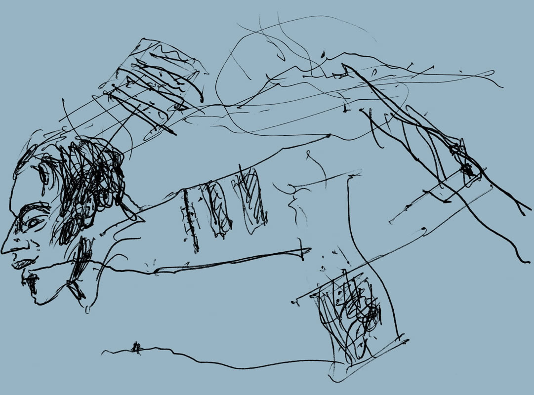
Philip christou sketch sketchbook architectural review 06
However, I was very concerned that the design was going through all sorts of contortions and too many complicated possibilities were being discussed. There was a great danger that it was going to get solidified into one of these options that I thought were just too fussy. In my view the form of the project needed more clarity and a more simple and uncluttered logic. So, I quietly got up out of bed one night and I took out some charcoal and an A4 pad of paper. I had in mind an image of the 500m x 50m thin slab rising out of the water at one end, like a skyscraper emerging from the sea. It would glow from the inside like the body of a transparent fish with all its internal organs visible.

Philip christou sketch sketchbook architectural review 03
I think I probably first drew the sliver-like building in side elevation rising up from the left to the right, with no apparent support under it on the right, as if it were a long sloping cantilever. The charcoal was smudged and varying in density along the length of the building to indicate varying densities of transparency within the body of the building. Then, I think I taped 2 sheets of paper together to make a long horizontal sheet and drew the aerial view looking down at the roof deck and putting the pier in context with the long suspension bridge that goes across the harbour as the horizon in the distance.
The building rises up from the bottom right corner diagonally in a dynamic angle, but with a relatively calm and simple rectangular form. The openings in the roof deck that make patios on the parking floor just below the deck, or provide ramps to take busses and cars down below the roof are drawn here. The third sketch made with some coloured pencils on some scrap computer printing paper with perforations along its edge was made to be slightly less impressionistic as the first two charcoal drawings were. The ramp that descends down under the body of the building to the ground surface of the pier is drawn, and the colours were meant to indicate that this large terminal building is like a large sloping container holding a number of smaller building elements within it’s envelope, with a variety of colours.

Philip christou sketch sketchbook architectural review 02
I was really happy when I presented these sketches to the team the following day, because I seemed to be successful with the effect they were meant to have. Although it took some discussion and argumentation, the project from that point on remained in this simple form, and we were able to work on developing the plans of the various floor levels with much more confidence and enjoyment.
Florian then made one of his most elegant and beautiful paper collage drawings of the plan of the upper deck. Small pieces cut out from photocopies of aerial photos were laid down onto the delicate printed lines of the computer-drawn plan. Field dimensions, sunken patios with orchards, ramps descending from the large sloping deck, together were to become a garden of the horizon.
Rex Henry and I made a model with clear perspex and paper in layers, (with the sea as a large slightly oiled steel sheet) so that when it was photographed the building partially dissolved, becoming almost invisible – an ethereal fabric of light.

Philip christou sketch sketchbook architectural review 05

Philip christou sketch sketchbook architectural review 04
Architect: Beigel Kawakami Architects
Design team: Florian Beigel, Philip Christou, Suresh A’Raj, Ada Yvars Bravo and Rex Henry in collaboration with Kisa Kawakami, with structural engineering advice from Martin Manning at Ove Arup & Partners Engineers.
This piece is part of the AR’s sketchbook series, in which we have asked architects to open their sketchbook to public conversation. Read more on the sketchbook on our In Practice page